
E-commerce Site
‘The Bleeding Babes’
My Role
UX/UI Designer: Wireframing, interaction design, and layout principles
Contributed sketches, moodboards, and storyboard scenarios
Designed annotated wireframes for the homepage, blog, and product sections
Applied visual hierarchy, accessibility, and UX laws to refine layouts
Role: User-research / Interaction / Prototype
Tools: Figma, Axure
Timeline: [ 12 weeks, Summer 2024 ]
The Bleeding Babes is a conceptual design project that tackles the stigma and lack of awareness surrounding menstruation. Our aim was to create a digital and physical campaign that normalises conversations about periods, empowers individuals through knowledge, and fosters inclusivity in how menstrual health is represented.
Project overview
Buying sanitary products is often fraught with barriers: stigma, lack of accessible options, confusing websites, and limited sustainable choices. Existing competitors show promise but also highlight gaps in usability, inclusivity, and transparency.
Problem Statement:
How might we design an online subscription platform for menstrual products that is empowering, sustainable, and easy to use while reducing stigma?
The problem*
We began our research with a competitor analysis with key takeaways such as the that sites excelled at aesthetics or values, but fewer succeeded at balancing usability with inclusivity and empowerment.
The process began with brainstorming and moodboarding. The final direction blended bold shapes and playful colours with the clarity and balance of cleaner, minimalistic boards. We then defined the target audience as busy adults, familiar with digital platforms, who value eco-friendly solutions and want a brand that feels authentic and trustworthy.
Research & ideation
Clarity, friendly tone and an eco-conscious outlook was prioritized.
User research combined eight interviews with a survey of 115 respondents. We found that users disliked cluttered layouts and wanted simple, reliable navigation.
User research
A mix of interviews, Google Forms and Instagram surveys to gain data.
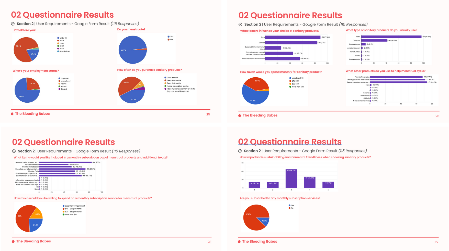
Findings were also based on in person observation on how participants navigated a web-page.
Pain points included unclear subscription charges, hidden shipping costs, and overwhelming product choices. Younger participants still felt stigma when buying products in-store, while eco-conscious users demanded more sustainable packaging and product options. Importantly, trust was strongly influenced by secure payment options such as PayPal and Apple Pay.
Our design requirements were shaped by this research. Functionally, the platform needed a flexible subscription builder, efficient search and filter functions, and clear account management for orders and payments. Non-functional requirements focused on accessibility, scalability across devices, data security, and visual clarity.
Design process

Key sections were restructured vertically for clarity, buttons and touch targets were made larger for accessibility, and typography was adjusted for readability on smaller screens.
Our design requirements were shaped by this research. Functionally, the platform needed a flexible subscription builder, efficient search and filter functions, and clear account management for orders and payments. Non-functional requirements focused on accessibility, scalability across devices, data security, and visual clarity. At the same time, we designed for mobile responsiveness.
We conducted a heuristic evaluation to identify gaps in the user experience. Missing confirmation steps, vague calls-to-action, and hidden saving features were flagged. Through iteration, we added clear exit buttons, sticky order summaries, and dedicated save functions for products and blog posts.
Feedback confirmed that navigation was smoother, the checkout process more trustworthy, and the blog section more engaging. Small adjustments, like higher contrast buttons, larger tap targets, and simplified language, significantly improved the inclusivity of the experience.
Prototype testing & heuristic evaluation
Final outcomes

Product
Blog

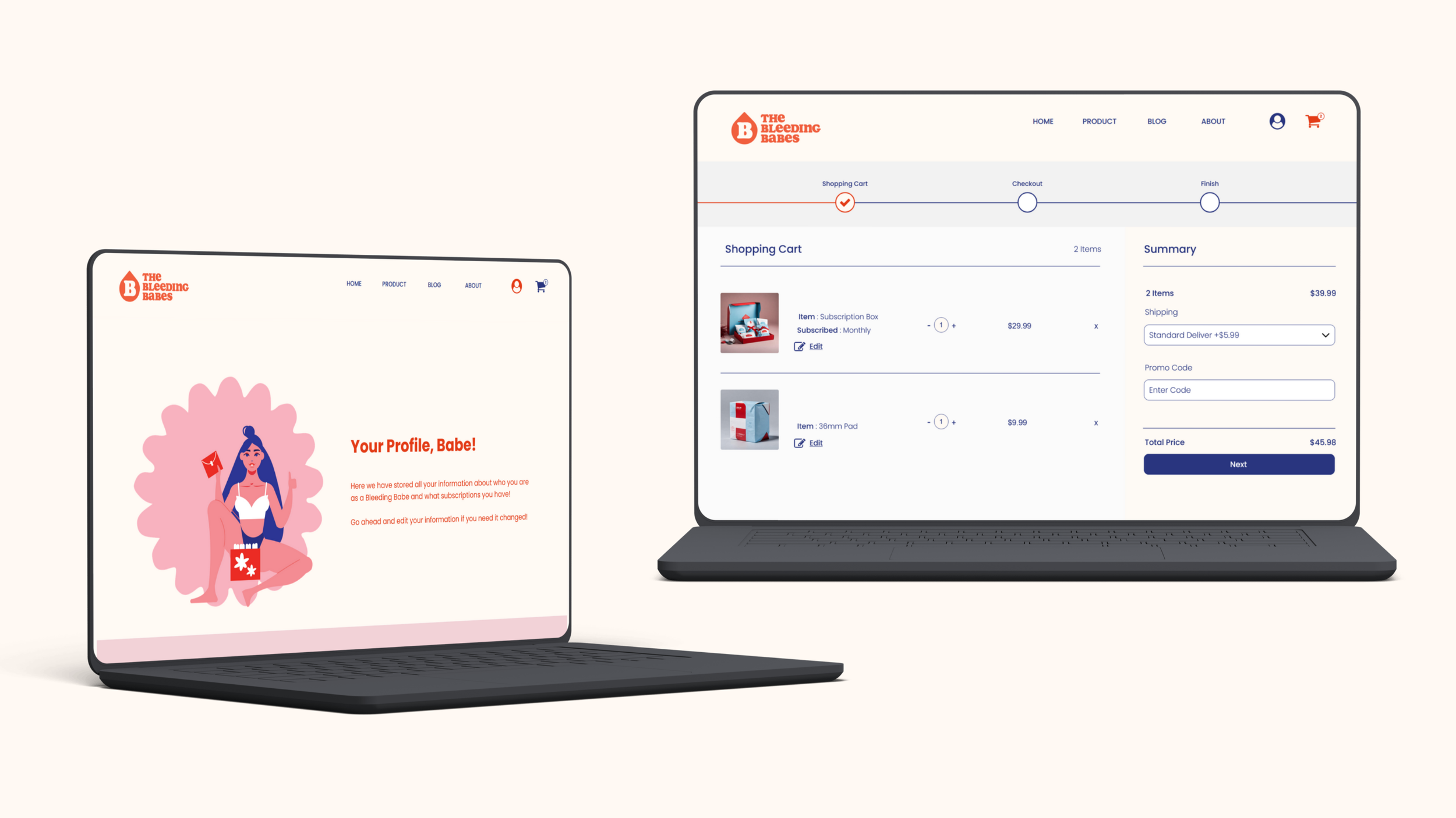
Cart
Profile
The visual identity, vibrant reds, deep navy accents, rounded typography, and playful graphics, was carefully chosen to be bold yet welcoming, with accessibility at its core.
The Bleeding Babes was designed as a stigma-free shopping environment that blends usability with bold branding.
The homepage introduces the subscription box clearly, with a strong call-to-action.
Product pages use image carousels, transparent descriptions, and customer reviews to build trust.
The custom box builder walks users step-by-step through creating their order.
The checkout flow is secure, simplified, and supports multiple payment options.
The blog section empowers users with knowledge while dismantling menstrual taboos.
This project demonstrated how e-commerce can be reimagined to serve both functional needs and social impact. The final concept addressed usability concerns while simultaneously tackling stigma through inclusive branding and educational storytelling.
What I learned:
Designing for menstrual health requires sensitivity to stigma, but also pragmatism in addressing usability and accessibility. Research showed that trust and transparency in the checkout process are as critical as sustainability or aesthetics. Small details, like progress bars, reminders, and confirmation steps, make a large difference in user confidence.