Community App
Gardening ‘Bud’ App
Audience & Context
User demographic: Adults 50+ who are interested in gardening, but may not be tech-savvy.
Needs & constraints: Larger buttons and fonts; simple navigation; familiar UI patterns; clear visual hierarchy; minimal cognitive load.
Context: Solo project, personal portfolio work, intended to demonstrate accessible and user-centred design practices.
Project overview
Role: UX/UI Designer
Tools: Adobe XD, Figma
Timeline: 12 Weeks
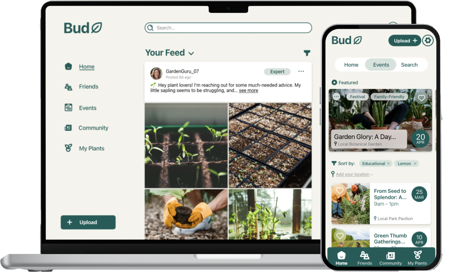
Bud is a digital storytelling application designed to foster gardening communities, especially for users aged 50 and above. The app provides a friendly space where people can share tips, explore events, and manage their own plants, all while encouraging social connection and healthier lifestyles.
The problem*
Many older adults enjoy gardening but struggle with plant care due to a lack of confidence, accessible resources, or social support. While apps for plant tracking exist, they often fail to create a sense of community or address accessibility needs.
Problem Statement:
How might we design an application that helps older adults connect, share gardening knowledge, and build confidence in plant care while remaining easy to use and accessible?
Research & ideation
Research showed that middle-aged and older adults often avoid unfamiliar interfaces, making familiarity and simplicity crucial. Accessibility considerations were central: larger buttons and text reduce errors, while high-contrast colours improve readability for users with vision difficulties.
Key insights included:
Familiar feed structures (like Facebook) reduce friction and increase comfort.
Uncluttered layouts and consistent padding reduce cognitive load.
Progressive onboarding (sequential sign-up, feedback cards, confirmation messages) helps build trust.
Community features like events and commenting foster engagement beyond plant care.
Design process
Branding
The name Bud reflects both the growth of a plant and the idea of a friend, aligning with the dual goals of gardening and community. A refreshing green palette with warm beige tones was chosen to create a calming, friendly atmosphere. Typography followed Apple’s “San Francisco” system font for clarity and consistency across devices.

Prototyping across devices
I designed Bud for mobile, desktop, and smart fridge platforms to ensure accessibility in various contexts.
Mobile: Emphasised large, tappable buttons, a welcoming greeting page, and a sequential sign-up process that allowed users to set preferences and track plants.
Desktop: Leveraged a sidebar navigation for easy access to events, plant tasks, and posts. Included a progress bar for sign-up and sliding feedback cards for user confirmation.
Smart Fridge: Limited to exploration features like reading posts, events, and plant tasks due to hardware restrictions, but still retained a familiar vertical interface.


Key features
Community Feed: Users can view and expand posts, comment, and engage with plant-care stories.
Events Page: A carousel highlights featured events, with filters for personal interests.
My Plants: Allows users to track tasks and group plants for easier organisation.
Content Creation: Options for regular posts or diagnostic posts with plant history attached.
Sharing: Posts can be shared to groups, friends, or external platforms, with feedback indicators for clarity.
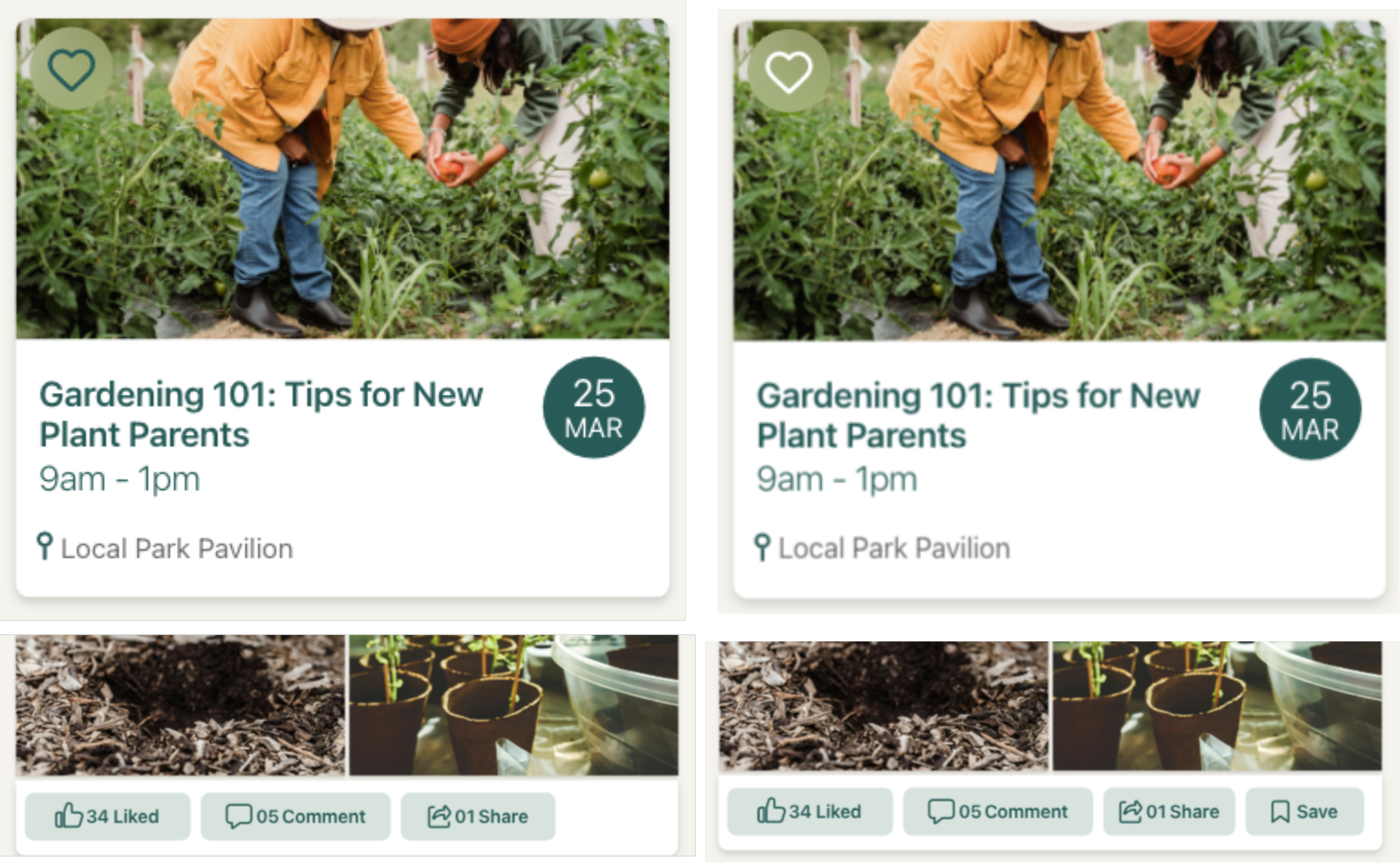
User testing & iteration
I carried out usability testing with 5 users aged 50-65, asking them to perform tasks such as signing up, posting with plant history, commenting, and exploring events and their plant collection using a paper prototype.
Findings:
On mobile, some users couldn’t see the navigation bar because of device overlays (e.g. hands or cases) and often missed the “exit comment” button.
On desktop, the “My Plants” and “Events” sections were less discoverable; users wanted quicker access.
Users asked for clearer icons for actions like “save” and “like,” and wanted previews of their plant history before posting.
Iterations:
Added higher contrast to icons (e.g., heart icon for liking events).
Introduced a dedicated save button for posts.
Ensured clear “X” icons for closing views.
Enabled plant history review before posting.
These refinements improved clarity, efficiency, and confidence in navigation.

Final outcomes


Events

Profile
The final designs aim to balance simplicity, accessibility, and community engagement. Key screens are clean, with generous spacing, strong typography, consistent padding, and a familiar feed layout to reduce learning curve.
Events and “My Plants” features empower users to engage in both digital and physical communities.
A minimal, column-based layout ensures consistency and readability.
Accessibility checks (colour contrast, scalable fonts, larger buttons) ensure inclusivity.
Reflection
The Bud app can demonstrate how digital design can strengthen social and personal wellbeing by combining usability with community-building.
What I learned:
Familiarity in design (mirroring existing social media patterns) is essential for older demographics.
Small UI changes, like adding contrast or preview steps, can greatly improve usability.
Designing across devices highlights the need to adapt workflows based on context and hardware limitations.
*The left is the before and right is after.
Added higher contrast to icons (e.g., heart icon for liking events).
Enabled plant history review before posting.
Ensured clear “X” icons for closing views.
Introduced a dedicated save button for posts.
The smart fridge was chosen to better give accessibility, and easy to glance at.
Familiar feed-like homepage lowers learning barriers.
Context: the outcomes for the project was to cater to an older target audience
Priorities were to make it ‘trustworthy’ so a cool-toned green was used.